 |
 |
 |
|
 |
 |
| |
|
|
|
|
 |
| |
Please note: Since 2013, this website is no longer maintained. To view my recent work, please visit http://the-medium.net |
 |
| |
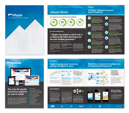
Sales Brochures and Booklets
Liftopia
Liftopia helps ski resorts generate lift ticket sales and provides skiiers and snowboards with huge lift ticket discounts through advanced online purchasing. I collaborated with The Medium's Creative Director Josh Tuininga and the in-house design team at Liftopia to create in total 3 presentation brochures (a 16-pg booklet, 4-pg CloudStore brochure promoting their web and mobile arm of the business, and a 1-pg overview sheet promoting the Liftopia Affiliate Program) as well as two 34" x 84" vertical banners to flank a table at events.
Designed for The Medium |
|
 |
|
 |
| |
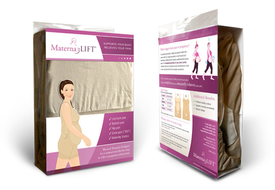
Maternity Support Packaging
MaternaLift
MaternaLift is an innovative and effective maternity support designed by a prenatal physical therapist to alleviate common back pain in pregnancy. I worked directly with the client to come up with a packaging concept that would show off the product, stand out to consumers in Maternity boutiques, and also have a "therapeutic device" association. In addition to designing the exterior wrap card and an internal informational card contained within the garment, I handled the entire production process, working with printers to achieve a custom diecut and sourcing the plastic boxes.
Designed for The Medium |
|
 |
|
 |
| |
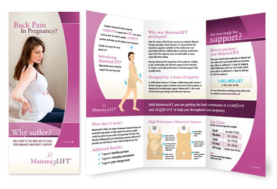
Maternity Support Brochure
MaternaLift
Designed a tri-fold brochure for MaternaLift, which was distributed in OB/GYN Offices to generate marketing and sales leads for their new physical-therapist designed maternity support. The look & feel continues to reinforce the MaternaLift branding I established in an earlier "MaternaLift: Stretch Solutions" 8-panel brochure piece and the packaging of the support (see above).
Designed for The Medium.
Custom illustrations by Joe Feliciano. |
|
 |
|
 |
| |
JASIRI 2012 Invitation and Event Collateral
Pilgrim Africa
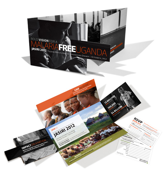
For Pilgrim Africa's annual fundraising dinner at Seattle's Fremont Studios, they asked me to create a compelling and memorable invitation that wouldn't be overlooked. The concept I came up with for the invitation was a completely unique form that begins with powerful black and white photography with brief impactful statements about Malaria in Uganda, and as the final flaps are opened, the design is in full color with a more hopeful message and the event information. The flaps also served as an enclosure for a letter written by the Ugandan Minister of Health and the RSVP/Donation Cards and reply envelope. I also created 10 vertical banners, the event program, and thank you cards for the event, which hosted nearly 400 people and raised over $305,000 toward eradicating malaria in Uganda.
|
|
 |
|
 |
| |
Pepperball packaging
Chef'n
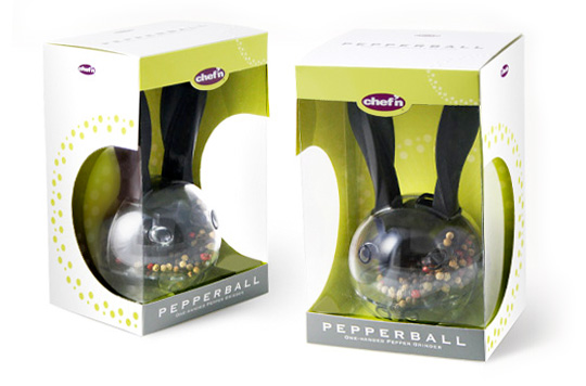
This packaging was created for the Japan market with the purpose of standing out on the shelf in an arena that is typically saturated with loud and overstimulating packaging design. The unique shape was conceptualized to show off the pepperball from all angles. The design is clean and simple while also upholding the "fun and vibrant" brand of Chef'n Corporation.
Designed while employed at Gravity Design.
|
|
 |
|
 |
| |
Presentation Materials
QMobility
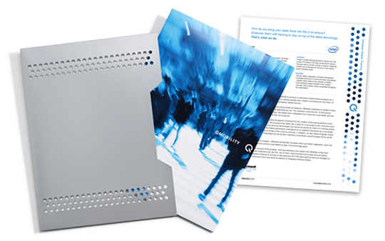
Because QMobility wanted to be known for being on the cutting edge of mobile technology, they wanted to pitch their business to prospective clients with a "wow" factor.
Designed this innovative presentation folder with a slip case flooded with a metallic silver ink, as well as the coordinating case studies to go inside. When removing the presentation folder from the slip case, a pattern of 136 laser drill holes reveal the cover of the presentation folder featuring an urban scene in motion blur. Also coordinated the print production of this complex and unique job, while keeping it within the client's budget.
Designed while employed at Gravity Design. |
|
 |
|
 |
| |
Sales Sheets
Pure Ayre
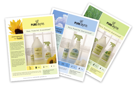
This series of three sales sheets were used by Pure Ayre to market their home, baby, and pets product lines to resellers such as QFC, Whole Foods, and Fred Meyer.
Designed the layout of these sales sheets to communicate Pure Ayre's "natural and effective" message and reinforce the brand from the new packaging design. Also assisted in art directing the product photoshoot.
Designed while employed at Gravity Design. |
|
 |
|
 |
| |
Brand Brochure
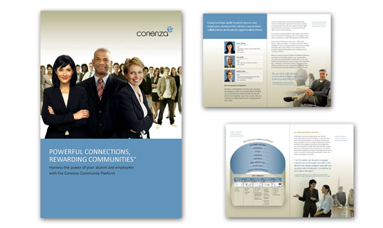
Conenza
Designed 16-page brand brochure for Conenza, a social networking platform provider for enterprises and organizations. They wanted their brochure to more closely relate to their newly-designed website. Brochure measures 7.5" w x 11" h.
|
|
 |
|
 |
| |
Event Invitation & Poster
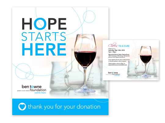
Ben Towne Foundation
Ben Towne Foundation is a non-profit organization aimed at pediatric cancer research. The Eastside Chapter of the organization hosted a "Cheers to a Cure" fundraising event to support groundbreaking research of Dr. Michael Jensen, Director of the Ben Towne Center for Childhood Cancer Research at Seattle Children's Research Institute. The invitation and donation table poster were designed to align with the Ben Towne Foundation brand look & feel, with an addition of a wine glass inserted amongst the science beakers to communicate the correlation of the two concepts at the event.
|
|
 |
|
 |
| |
Business Cards
Various Clients
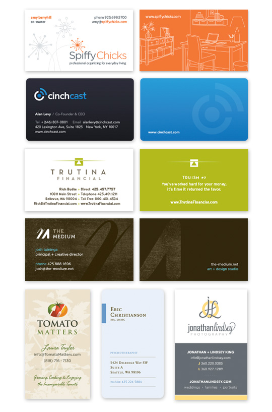
Top Row:
Spiffy Chicks, professional organizing for everyday living (also designed logo and back side illustration)
2nd row:
Cinchcast, providing cloud-based solutions for conference calls and webcasts to enterprise businesses.
3rd Row:
Trutina Financial, formerly Bellevue Financial. Trutina Financial means balance -- for businesses and individuals alike.
Designed for 5ive Creative.
4th Row:
The Medium, art + design studio.
5th row, left to right:
Tomato Matters
(Designed for The Medium)
Eric Christianson Psychotherapist
(Designed for The Medium)
Jonathan Lindsey Photography
|
|
 |
|
 |
| |
Marketing and Stationery Collateral Kit
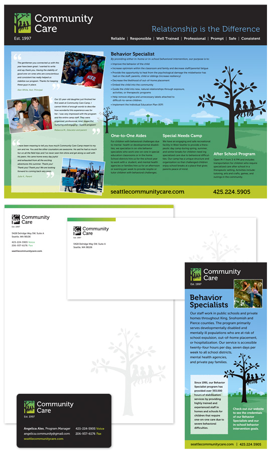
Seattle Community Care
Community Care provides one-to-one aides and behavior specialists for special needs children and youth in the Seattle area. Their rebranding effort was a true collaboration between The Medium's Creative Director Josh Tuininga and myself. I designed some initial logo options and Josh refined the logo and type treatment to create the final logo as well as their new website. He then passed the baton back to me and I used the look & feel and visual assets (color palette, tree, city skyline, textures, and fonts) Josh designed for the website to create their entire print collateral kit. The 28"h x 38" wide Poster is used at events, along with 2-sided rack cards and letter-sized flyers for their behavior specialists and various camps. I also designed their stationery kit, which includes the letterhead, envelope, and business cards.
Designed for The Medium.
|
|
 |
|
 |
| |
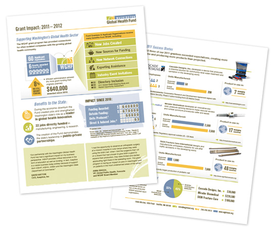
Program Success Infographic Fact-Sheet
Washington Global Health Fund
WGHF is an arm of Washington Global Health Alliance that awards grants to organizations in the global health technology field and creates jobs in Washington State. This 2-sided "Annual Report" fact sheet features custom infographics outlinting the success of the fund and the fund recipients, and the amount of jobs generated in Washington state in the past year.
Designed for The Medium.
|
|
 |
|
 |
| |
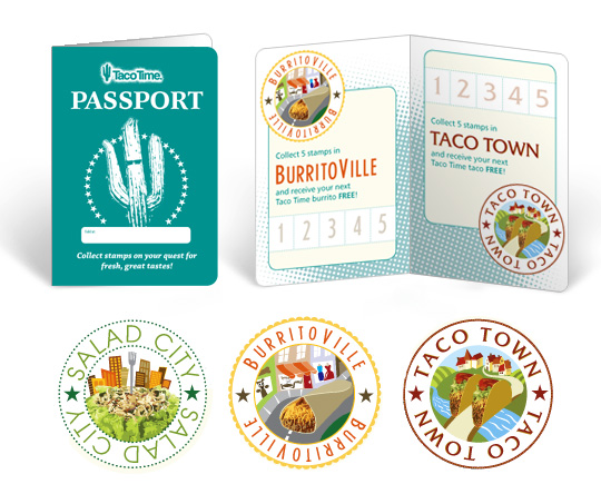
Stamp Card "Passport"
Taco Time
Taco Time restaurants wanted a memorable and fun way to encourage their regular customers to buy their best-selling products.
Created this "Passport" booklet, complete with unique illustrations for each of the product categories. It is unknown whether Taco Time has implemented this into any of their restaurants at the time of this posting.
Designed while employed at Gravity Design. |
|
 |
|
 |
| |
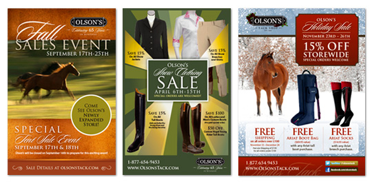
Marketing Campaigns
Olson's Tack Shop
For over 2 years I have been creating marketing materials for Olson's Tack Shop for almost all their major events and sales campaigns, which typically includes a printed postcard, ads in various sizes for local horse publications, an email blast, homepage web graphic, and occasionally also store signage.
Designed for The Medium. |
|
 |
|
 |
| |
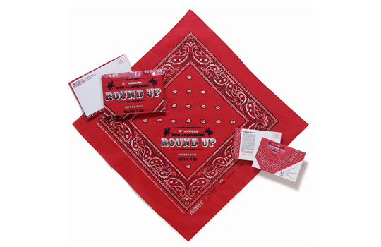
Round Up Invitation
Northwest Strategies
Created this invitation and save-the-date card for a political organization's 2nd annual end of summer networking event while employed as a summer intern at Platform Creative. Since the event was held at the founder's private ranch, the Western Round Up theme set the tone for this informal, fun gathering. The invitation was silk-screen printed on solid red bandanas and then enclosed in a clear plastic envelope.
Responsible for design, production management, and contributions to the Old West style copy writing, creating custom rodeo elephant and donkey icons, and illustrating a treasure-hunt style map to the event. |
|
 |
|
 |
| |
return to top |
|
|
|
