 |
 |
|
|
|
 |
| |
|
|
|
|
|
| |
Go Red For Women
American Heart Association
The original American Heart Association red dress logo needed a younger, more modern reinvention to appeal to the wider demographic the AHA wanted to reach. The logo was implemented into a national campaign by New York-based PR Agency Edelman. Visit www.goredforwomen.org to see this logo in action!
Designed while employed at Pravda Studios,
via Edelman.
|
|
|
|
 |
| |
Ethiopian Agrigultural Transformation Agency
The Government of Ethiopia has created the Agricultural Transformation Agency to drive the transformation of the agriculture sector in Ethiopia and realize the interconnected goals of food security, poverty reduction, and human and economic development. See www.ata.gov.et for more info.
Designed for Eben Design via The Medium.
|
|
|
|
|
| |
eBible
eBible is a new, online Bible software that is clean, free, simple and made for regular folks to experience a deeper engagement with the Bible. The mark was designed to evoke an inspirational and passionate feeling about reading the Bible.
Designed for The Medium.
|
|

|
|
|
| |
Washington State Main Street Program
Since 1984, the Washington State Main Street Program has been helping communities revitalize the economy, appearance, and image of their downtown commercial districts. The new identity for the program reflects this feeling of revitalization, and various aspects of the unique heritage and attributes of small-town Washington.
Designed for The Medium.
|
|
|
|
|
| |
Jarvis Financial
This local, family-run financial planning firm with a target market of moderately wealthy seniors wanted their brandmark to communicate the following messages: Committed, Integrity, Knowledgeable, Comprehensive, and Reliable.
Designed for Cultivate Design.
|
|
|
|
|
| |
Spiffy Chicks
Professional Organizers
Spiffy Chicks is a start-up professional organizing service co-owned by 2 women in California.
Worked with owners to complete a branding exercise that helped define their 'brand values' as Clean, Feminine, Fun, Modern, Sophisticated, and Stylish. Logo and brand materials were designed to capture all of these values. |
|
|
|
|
| |
Incite Partners
Designed logo for a start-up branding and consulting agency as a freelance project. Worked directly with the principals of this agency to develop a logo that would communicate their forward thinking and dynamic approach. Also designed their business cards and stationery.
|
|

|
|
|
| |
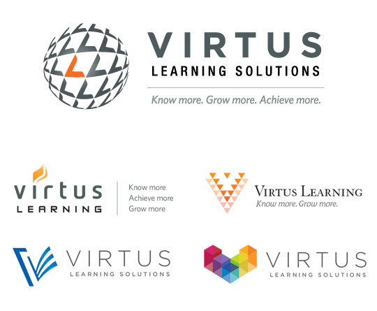
Virtus Learning Solutions
Virtus Learning Solutions provides assessments and workshops for organizations around the world to meet their specific leadership and management training needs. The logo mark incorporates both the "V" and "L" as well as upward arrows to communicate growth, and a dimensional sphere to represent the global nature of the organization. I also came up with their tagline, "Know more, Grow more, Achieve more." Some of the various logo studies from the Round 1 design study are also displayed below.
Designed for The Medium.
|
|
|
|
|
| |
Seattle Against Slavery
Non-Proft Organization
Seattle Against Slavery is a start-up non-profit organization working to end human slavery, one city at a time. The identity incorporates distressed type and rugged elements to convey the appalling underground activity of human trafficking. Several local, national, and International anti-trafficking organizations have partnered with SAS to become a strong, local coalition. |
|
|
|
|
| |
Semper Vita Institute
Semper Vita Institute specializes in the personality and strengths-based coaching and training of individuals, executives, teams, organizations, marriages and families. The mark suggests the idea of people as puzzle pieces, reflecting the concept that when people know their strengths and God-given character traits, they can determine how best to support and connect to their community or organization. "Semper Vita" is Latin for "Always Life".
|
|
|
|
|
| |
Leslie Ota
Real Estate Agent
Windemere Real Estate Agent Leslie Ota serves the highly competitive downtown Bellevue area. Leslie selected this logo because she agreed her last name, Ota, was memorable, concise and strong and the faint O in the background played off the O for Ota as well as the idea of targeting in on properties for her clients.
Designed while employed at Gravity Design.
|
|
|
|
|
| |
Christy Cowan Photography
This logo was designed for a friend who decided to turn her incredible, natural talent for photography into a business of capturing stunning images of babies, children, and families. (Plug for Christy!)
|
|
|
|
|
| |
return to top |
|
|
|